TimedWell
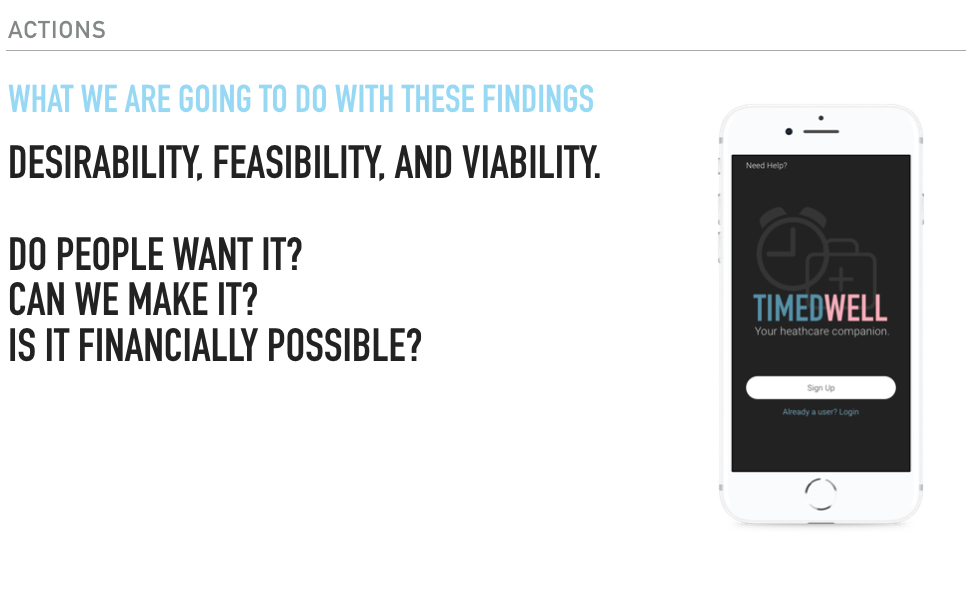
TimedWell is a mobile and web based medical app using conversational design to make healthcare more accessible. It's a third party concierge service focused on customizing care to save patients from confusion, cost, and time wasted in the current American medical system.
Role
UX/UI
Team
Vidya Keshavan
Research
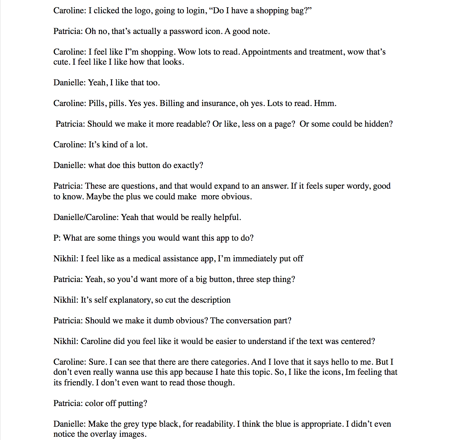
The research phase synthesized all findings around users relationships with healthcare. Immersing ourselves in the environment involved desk research, observational research, experiential research and user interviews. These techniques helped identify pain points which lead to actionable insights. We knew what people wanted was great care from a real person. This inspired a conversational UI that allows for interaction with real healthcare professionals.
We wanted to make a product people enjoy using, we wanted them to fall in love with healthcare. Since a solution can only be as good as the depth of the understanding of the problem we spent a considerable amount of time on interviews, observations, and documentation. What are the hardest and best parts of healthcare? When was the last time you experienced this? How did you solve that problem? These questions enabled us to gain understanding and empathize with others.
Creating user journey maps for each person we interviewed and observed became a way of identifying features that would make the app expressive and functional in ways that solved the problem and appeared clean. Affinity mapping insights into themes and framing themes gave us an idea of what was and wasn't important to keep. This created actionable insights which we turned into a hypothesis ready to test with prototypes. We believed that a simple app with conversational UI and real people could bridge the gap in healthcare experiences. We knew we were right when people's relationship with medicine changed.
Prototyping
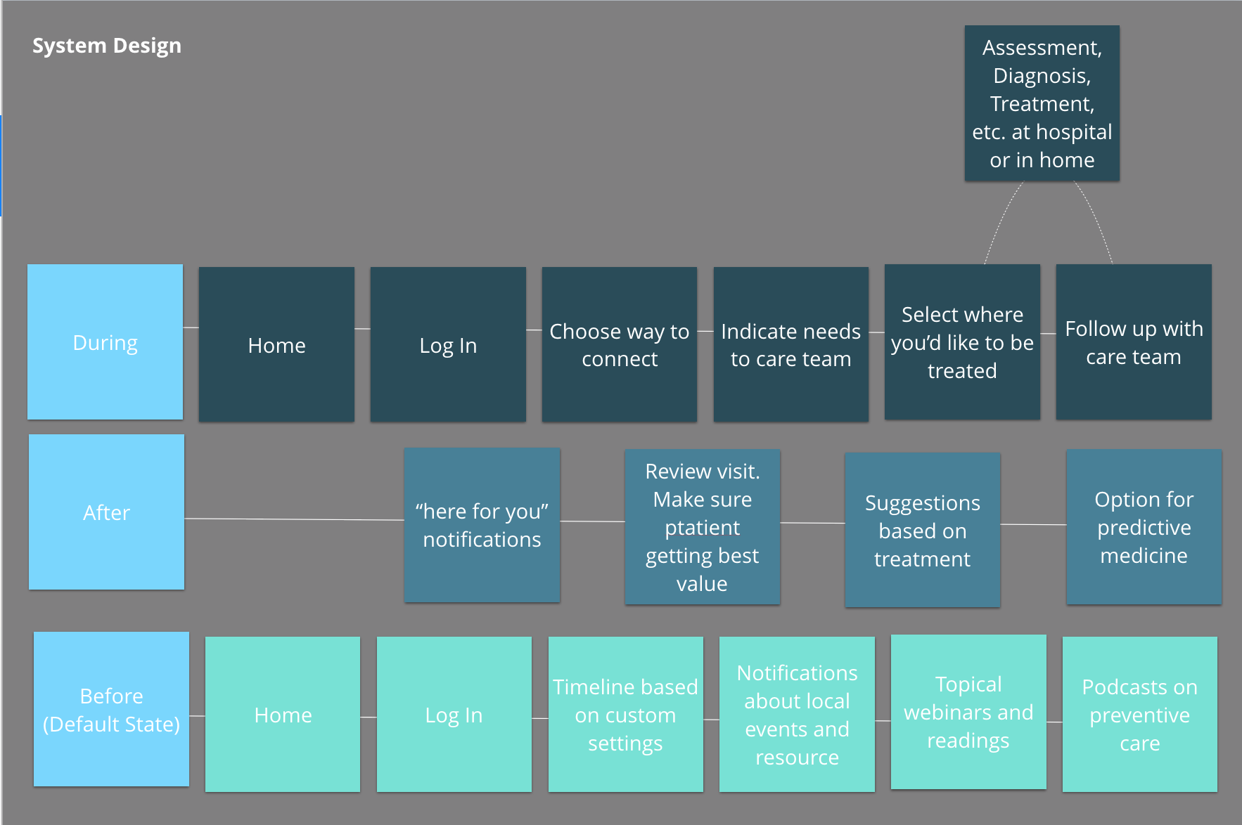
We created prototypes to elicit reactions about what users wanted out of TimedWell. We iterated based on interviews and reactions. Users tested prototypes and assisted us in correcting the product and experience. These conversations highlighted the insights we wanted to learn. Sketching very ideas provided clarity. With each round of testing our prototypes become more detailed. This is because we asked more specific questions between tests. These questions dictated fidelity. Phases were paper prototyping, Lo-fi, Mid-fi, and Hi-fi.
Systems
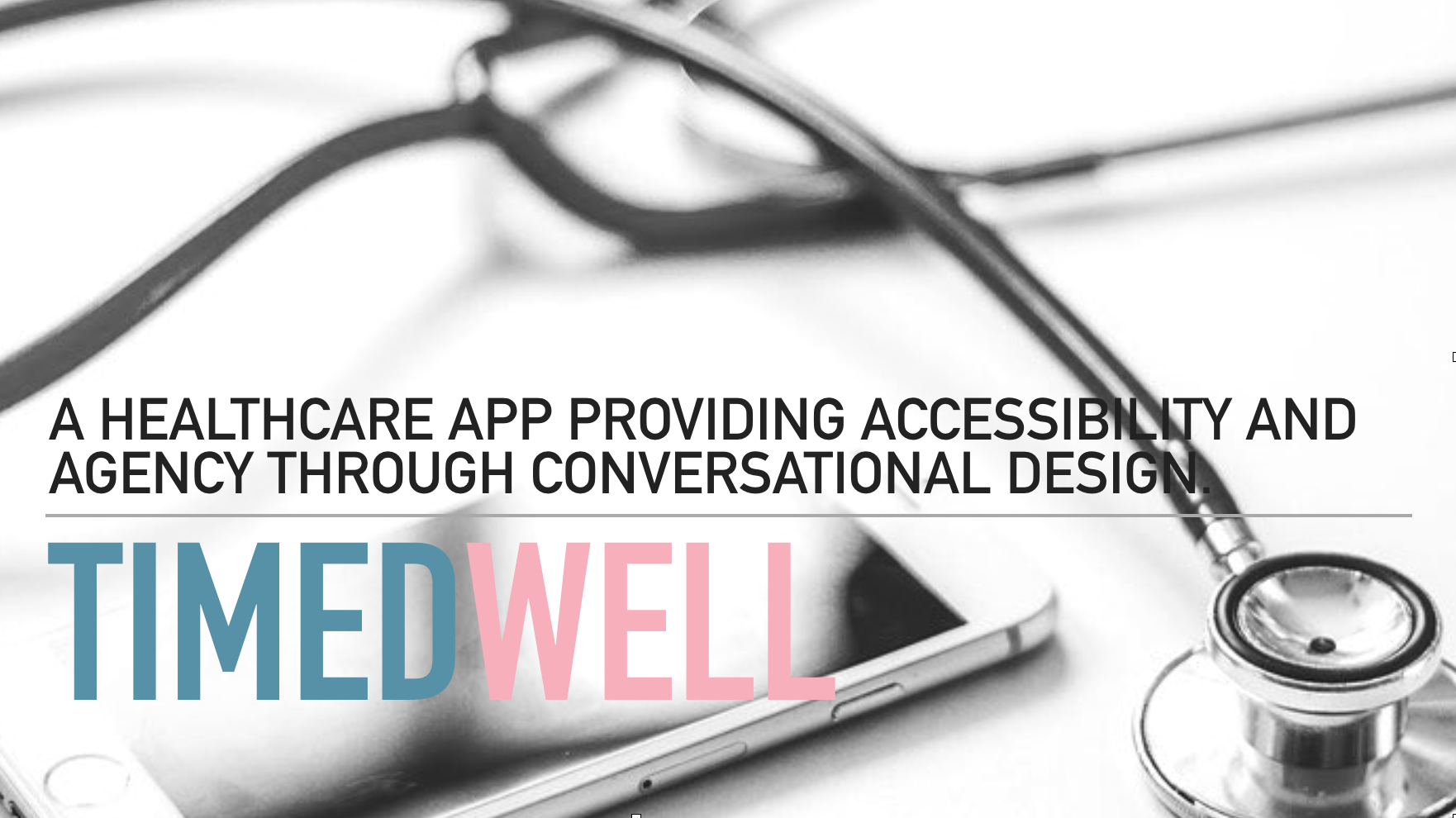
Designing systems for TimedWell involved plotting out everything we knew about our product as to not miss anything. This helped us see the bigger picture, made sure we didn't miss anything, and was great for capturing findings and ideas. User journeys helped develop a linear flow through TimedWell, focused on what users would be doing, not what's on a screen. The complexities involved in healthcare and patients' experience lead us to build out a service blueprint. Having this linear flow with multiple layers allowed for an immediate connection between users and the care they receive. System Diagrams visualized how we would map out our system architecture and see the linkages between screens. Through all of this we were able to identify which parts that surfaced and developed are critical to our product and what we needed to know more about to design it well. System mapping gave us the insight to think about a logical navigation not a linear flow. We looked at the actions a user would be doing each step of the flow. We grouped similar actions together. We logically lead actions to each other. This became a working document that remains continually updated.
Final Product
After examining all findings again, we were able to iterate and fine tune. Putting everything on the wall let us get back to the heart of the product. When we reminded ourselves why we made TimedWell and what it would be we were able to synthesize findings across all phases. We considered desirability, feasibility, and viability. Do people want it? Can we make it? Is it financially possible? The answer is yes. We tested our flow with potential users, came up with a business model and spoke with developers. TimedWell is nowhere near perfect but it is on its way to becoming a mobile and web based medical app using conversational design to make healthcare more accessible.